Ihs Enerdeq Browser

Query screen enhancements for a flagship NA oil & gas application

Interaction & Visual Design

Overview

About the app

IHS Enerdeq Browser is a flagship web application used to access North American well, production, land, and activity data. Clients use the data (subscription-based or proprietary client-side data) and features of the application to make key exploration & production decisions, conduct analysis, work with maps, as well as viewing and downloading reports.

Design Objective

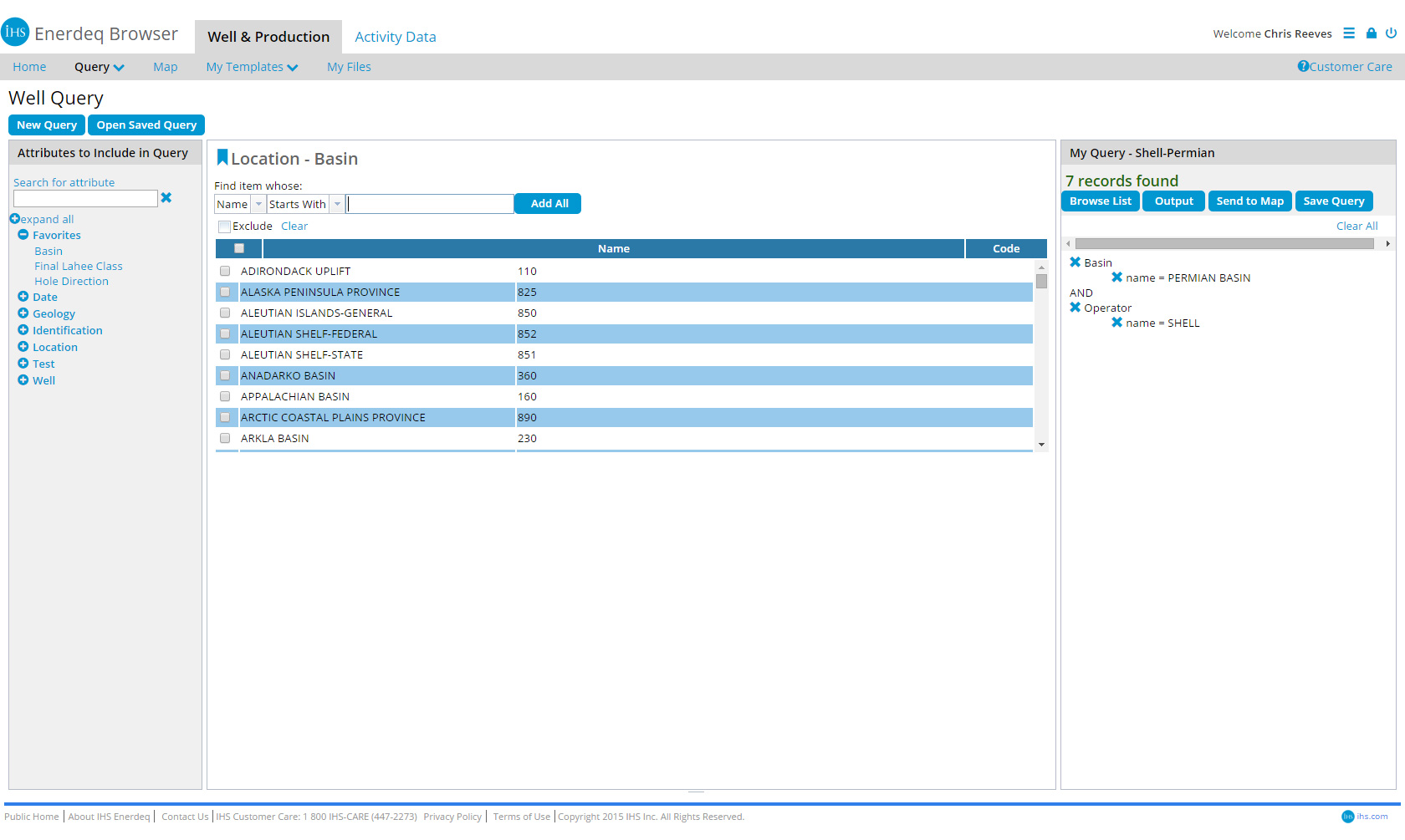
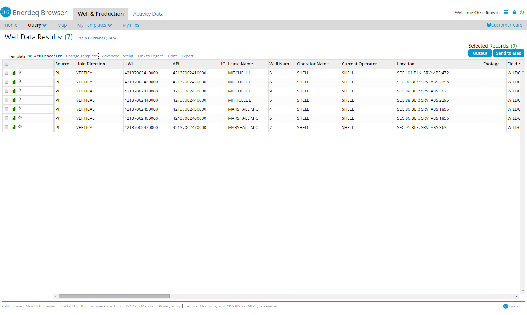
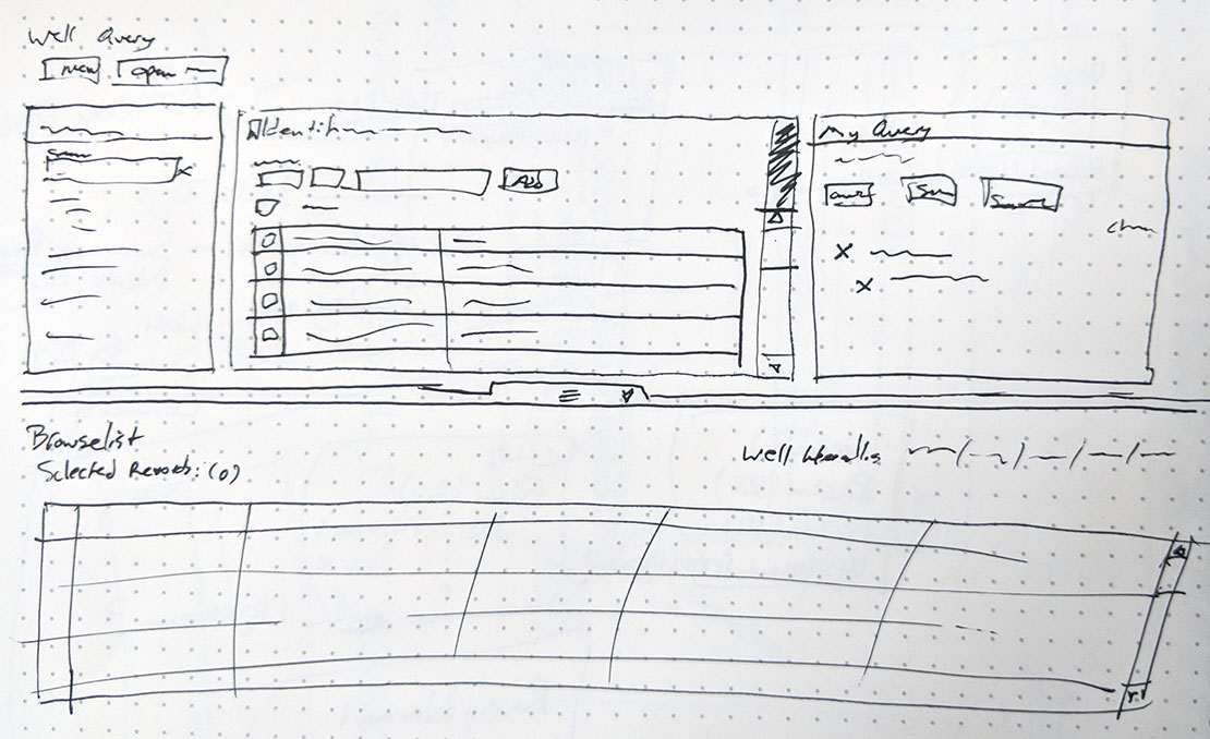
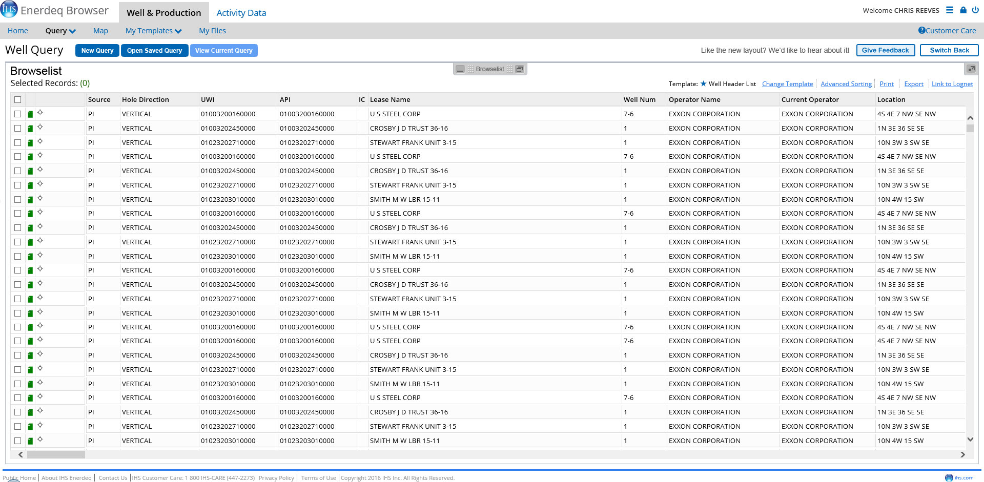
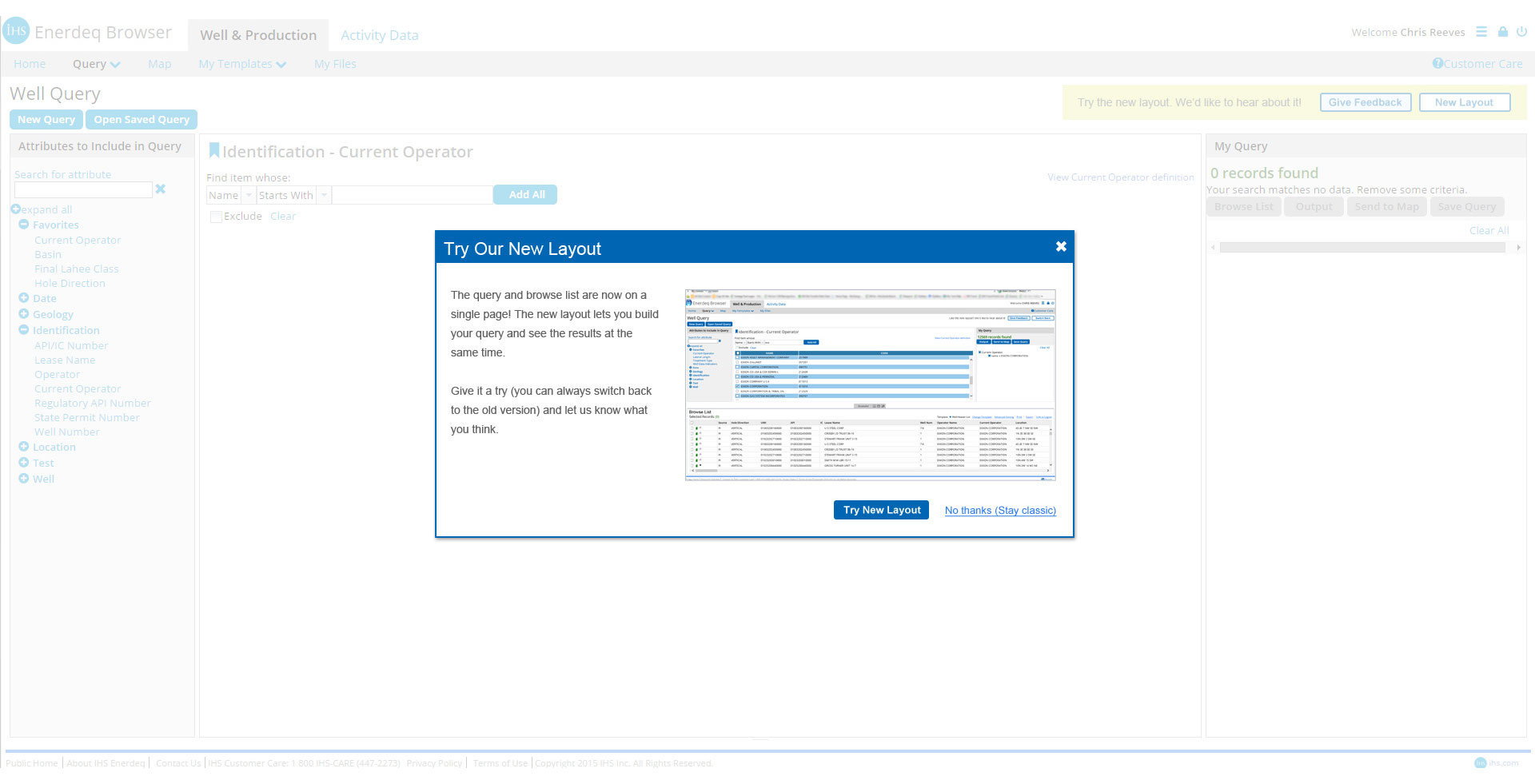
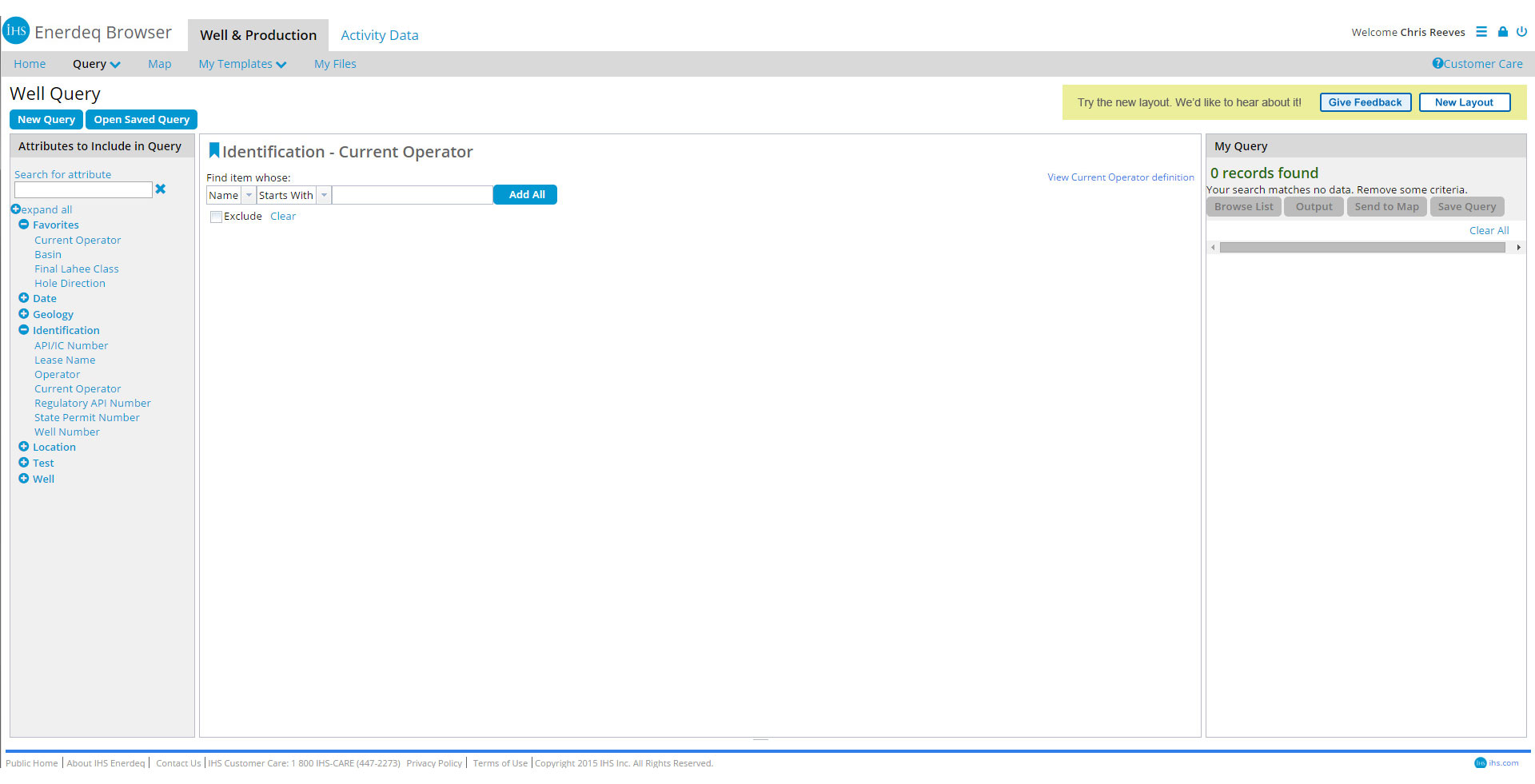
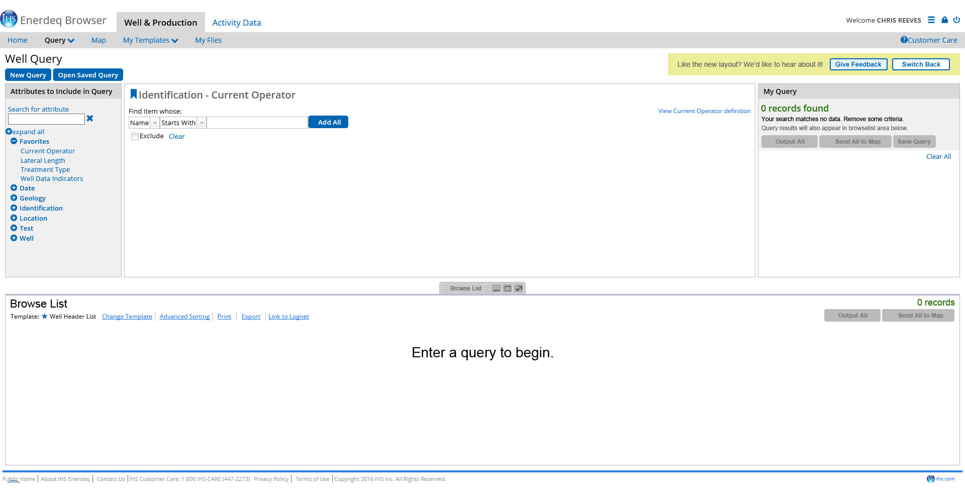
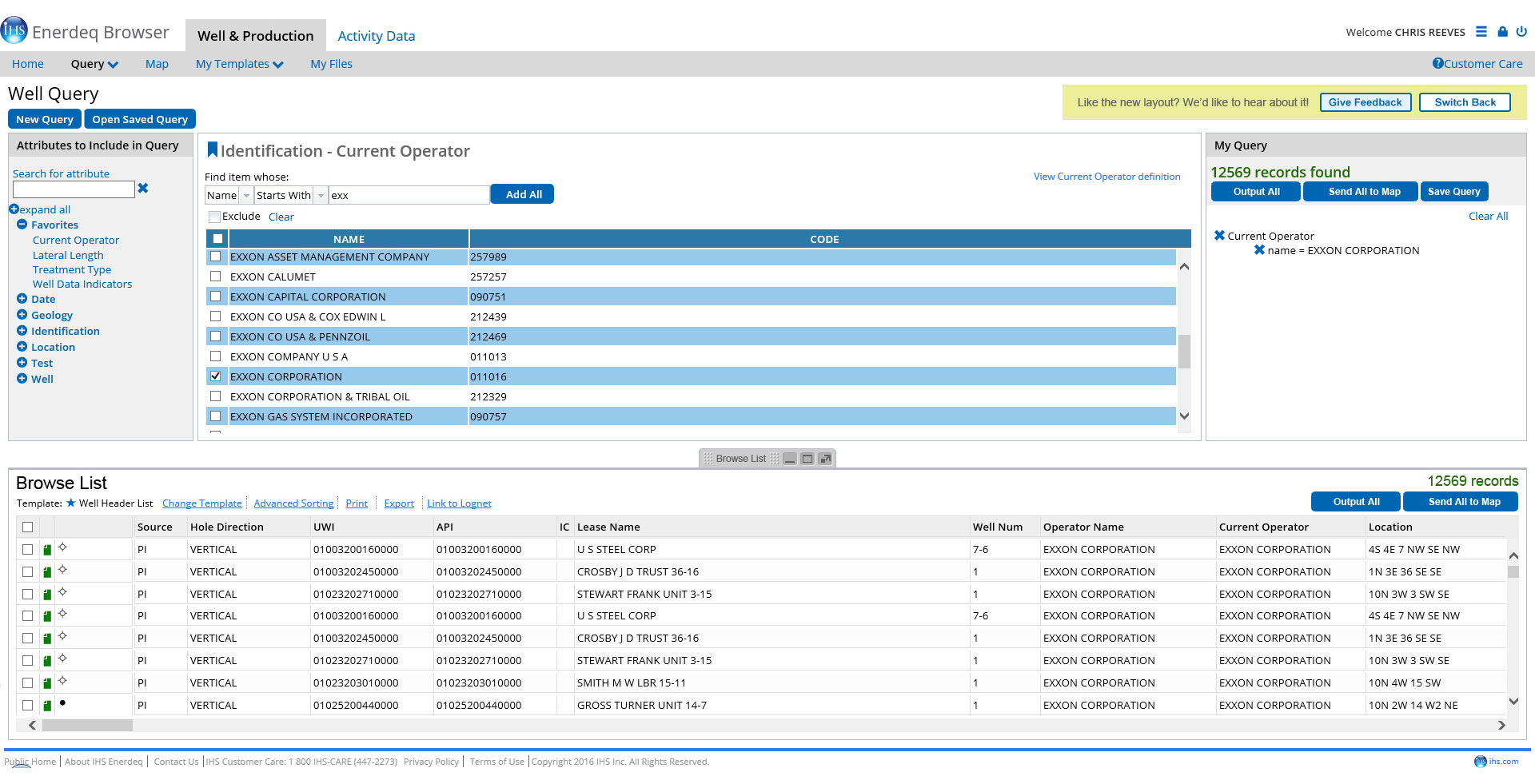
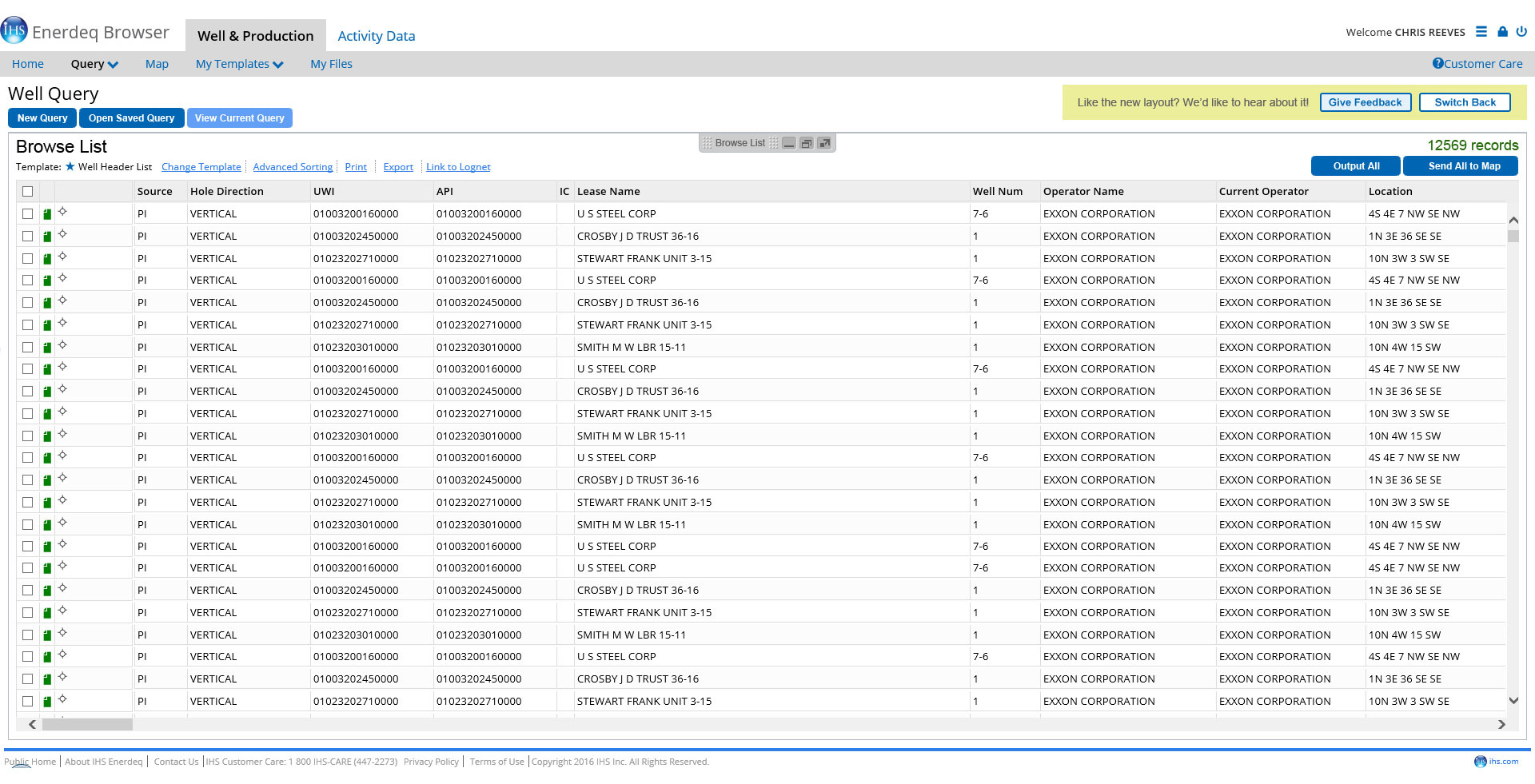
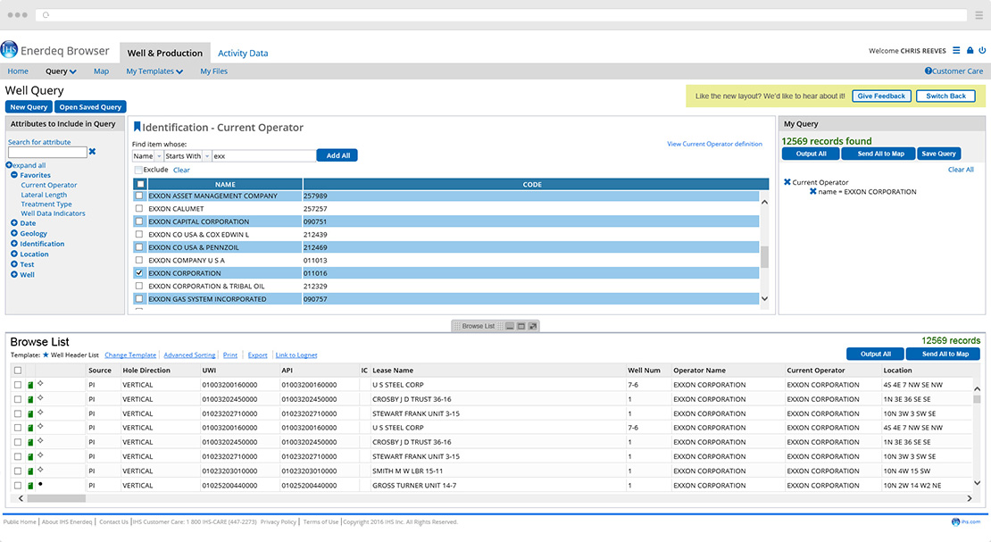
The data query is the area where users search and filter their data... queries themselves range between simple and complex. The browse list is where query results are displayed in the form of a table where matching entities are returned. Both of these screens existed independently of each other and were two of the most critical screens in the application. The main focus of this deseign effort was to improve user workflows between these two screens by merging them into a single unified screen.

My Role

I was lead designer on this effort, responsible for all the interaction and visual designs involved. My work was peer reviewed with the rest of my senior UX team, as part of our normal process, and some A/B testing was done by our user researcher.

Process

Discovery

This project was actually pretty straight forward. We received clear requirements from the product owner and the decision to combine the query and browse list features into a single screen seemed like a logical one by all parties. This was further backed up by user sentiments when recent customer support logs were reviewed.

The initial requirements were very simple... merge the two screens and ensure no loss of function. I spent a bit of time thinking about what else we could do to make a new design better and more functional for the end user and discussed some ideas with the rest of the UX team. The team agreed that a top/bottom split screen layout would work great and had some nice parity with other desktop products our company provided that many of these same users worked with. I wanted to provide the users with some additional control over their view and suggested that we allow users to adjust where the split was placed as well as some standard panel min/max/restore controls. Since it's common for Enerdeq users to have very large monitors or multiple monitors, another idea was to allow users to pop-out the whole browselist section into a new browser window to further customize their workspace. Lastly, since we knew that Enerdeq users tended to be more resistant to big changes than some of our other products, we wanted to provide a way to ease users into a new layout. We came up with an idea to allow continued use of the old layout or switch to the new one. Users would have the ability to toggle between the two layouts and also provide feedback. 

We held some follow up discussions with the product owner to discuss our ideas and check technical feasibility with the dev team. I presented a rough sketch and walked everyone through what we wanted to do, which was all really well received. The only catch was that the dev team wasn't sure about the added pop-out functionality for the browse list, though similar functionality was planned for the near future for another panel on Enerdeq's map screen. For the initial release of the design, it was agreed that I would deliver the full design as planned but the pop-out functionality would be added in at a later date along with the aforementioned map panel.

  • Merge functionality of the query and browse list into a single screen to streamline user workflow and provide closer to real-time results viewing.
  • Ensure no loss of function for query or browse list features.
  • Allow users to adjust view of browse list area: draggable split-screen, min/max/restore, and possible pop-out fuction.
  • Provide introduction to new layout and method for users to provide feedback.
Fig 2 - Original browse list screen example
Fig 3- Early sketch of proposed design

The new layout

Since the layout was fairly straightforward and knowing that we wanted to at least do some A/B testing with the design, I decided to go ahead and produce the concepts in high fidelity. Several split-screen and panel control styles were tried and iterated on until we had a satisfactory solution. The majority of the design phase was actually spent mapping out the interactions for switching between old and new layouts and the related toggle controls for that as well as the various states for the browse list + query views (ie. how is the query screen accessed when the  browse list is maximized).

Fig 5 - Early concept showing a maximized browse list

Periodic A/B testing was performed on individual screens to help refine minor details such as element placement and visual cues. In addition, we also tested a sample workflow of performing a typical query search to viewing and exporting of browse list results that compared the old layout against the new. It was quickly revealed that the new layout was a clear winner, garnering overwhelmingly positive feedback.

Results

Happy users

Final designs and test results were presented to a very pleased product owner and dev team. I collaborated closely with the dev team to ensure accurate implementation and the first release of the new feature went off without a hitch. After a few months of overhwelmingly positive user feedback, the old layout was retired and the layout switch toggle was removed. We heard a lot of feedback about how much more streamlined users felt their workflows were and how they loved seeing query results on the same screen right away.

Fig 6 - First time view after release on old query screen
Fig 7 - Old query screen with switcher and feedback controls
Fig 8 - Entry, new query layout
Fig 9 - New query layout with query values
Fig 9 - New query layout with browse list maximized
Fig 9 - Feedback dialog

I like the new browsing layout! It saves a step, I can see the browse table immediately.

- D.B., Geologist

© 2018 Modcollectiv. All products/brands/trademarks copyright of their respective owners. Made with  in Houston, Texas.