Vantage

Evolution of a modern map-based Energy web application.

Art Direction, Research, Interaction & Visual Design

Overview

About the app

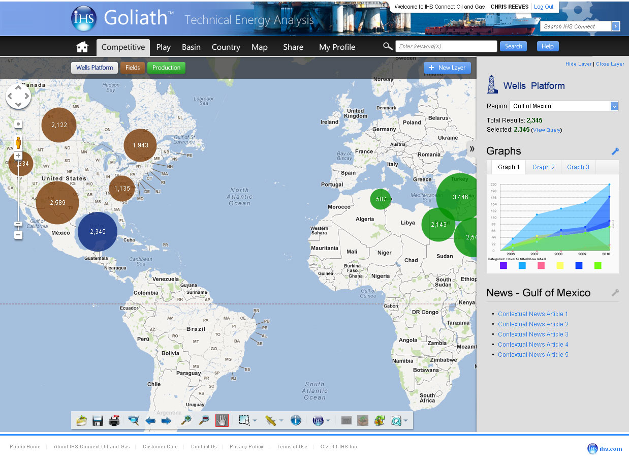
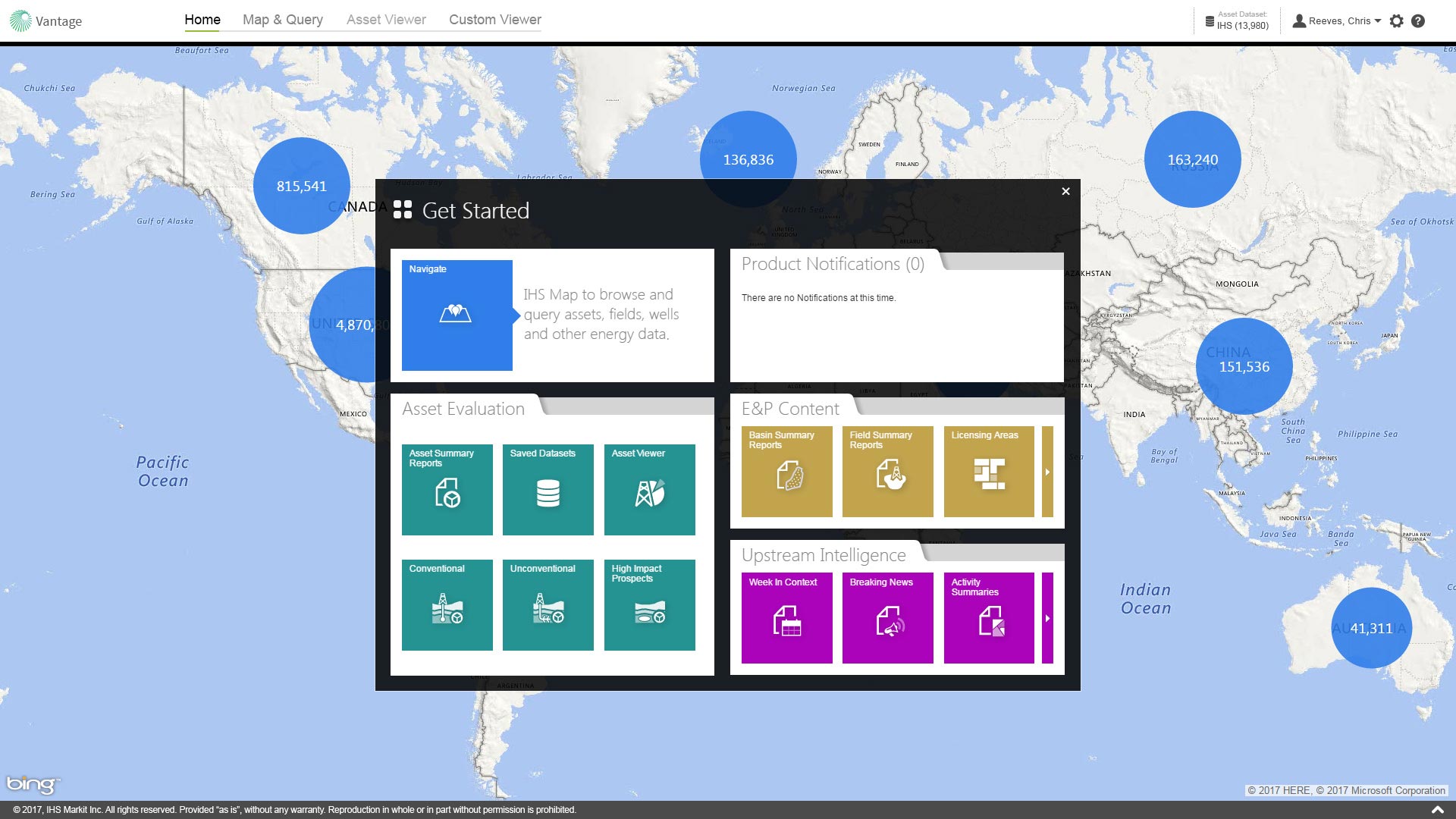
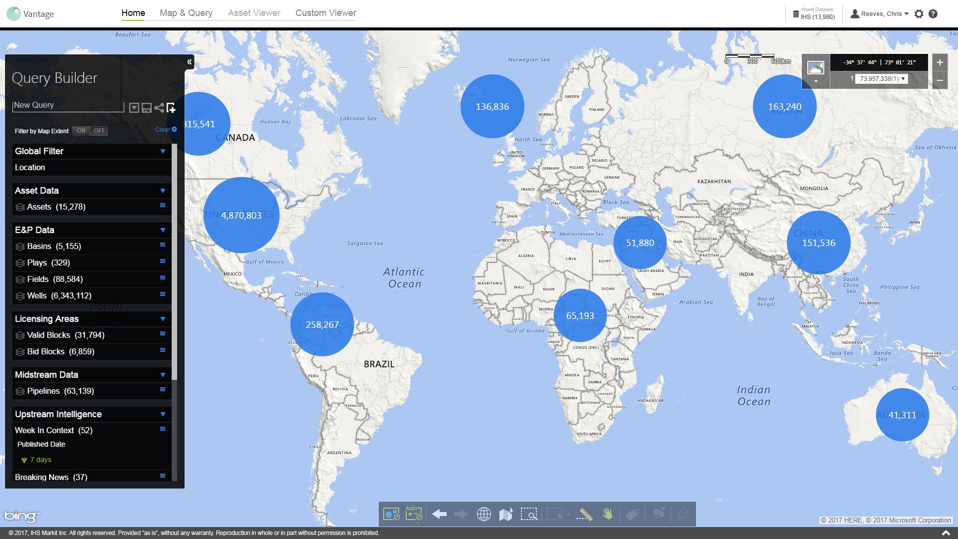
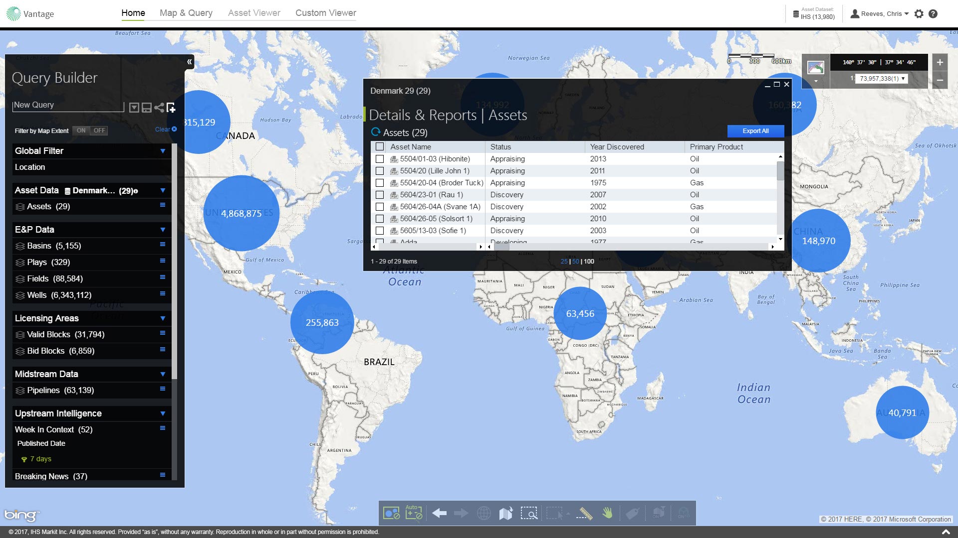
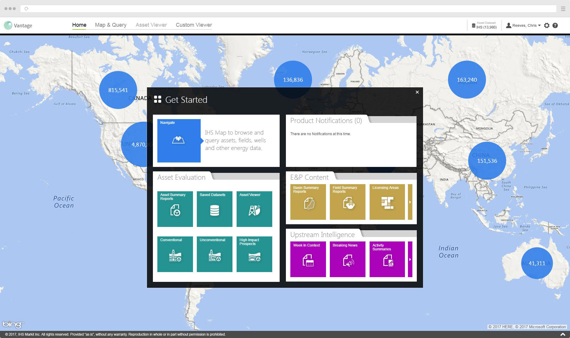
From its inception, Vantage was an application engineered to revolutionize IHS's upstream Energy products. It was built from the ground up to offer contextualized global data searches on a map-based interface covering exploration and production, editorial, and eventualy financial data for both conventional and unconventional assets with forward-looking production. It was designed to be modular with room for future expandability.

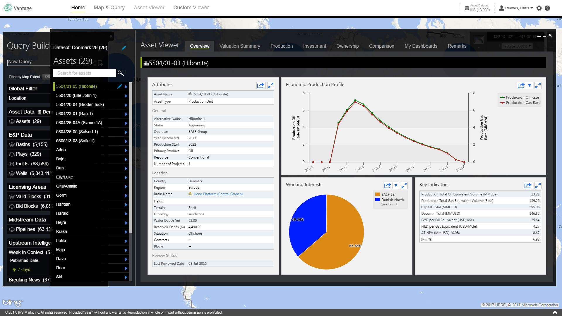
Soon after the first release of the product (called "IHS Navigate" at that time), business leadership decided to branch development into 2 products to be developed in tandem. IHS Navigate would continue to focus heavily on expanding content for exploration & production, midstream, land, editorial, and spatial data. Meanwhile, the new product called "Vantage", would focus on supporting the financial side of upstream Energy with asset valuation, point-forward forecasting, and analytics. Eventually, both products were merged and re-integrated and kept the Vantage name.

Design Objective

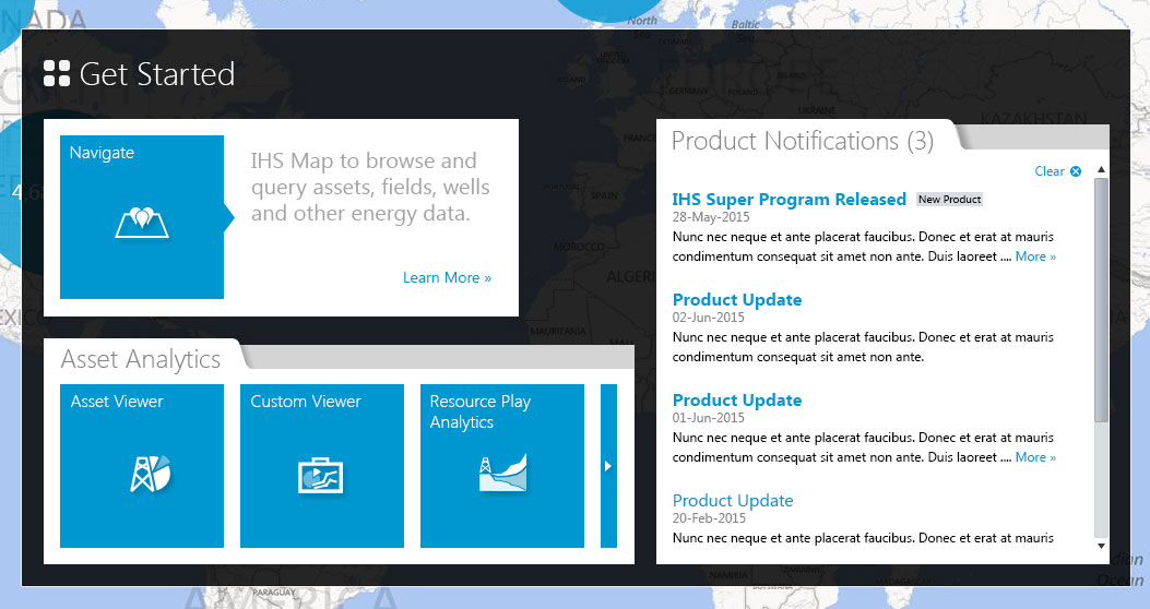
Create a new modern map-based application that offers global Energy data in a single portal interface that provides a rich and contextualised customer experience. In doing so, this would meet the expectations of our biggest global customers to supply global information via a single application on which to base decisions and to defend IHS's market position against emerging competitors.

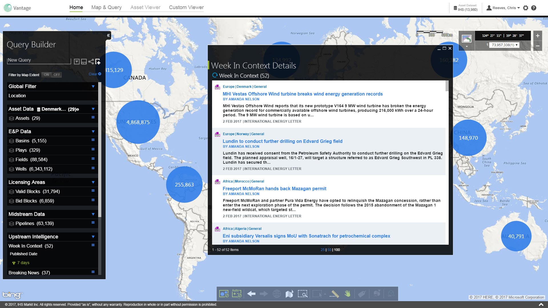
Initially, the project was heavily focused on E & P content but would expand and morph to eventually include energy editorial and financial focuses as well.

My Role

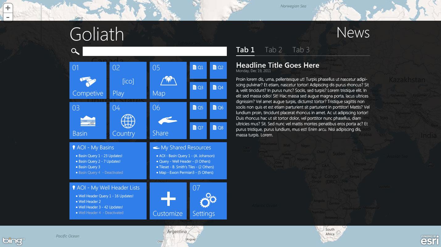
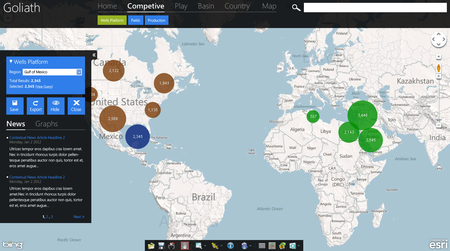
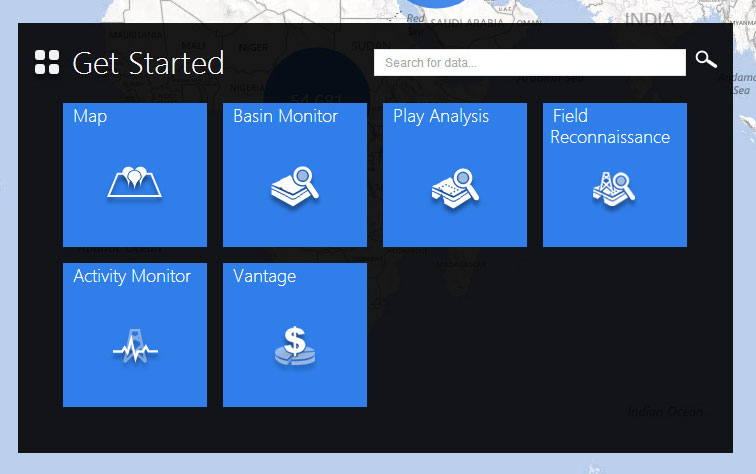
This was a large project where I was part of a collaborative team of other UX designers and was involved with this project since day one. Over the years, I held a number of roles in the project, often simultaneously! 

I was mostly involved in an art direction/visual design and interaction design capacity but also contributed research and occasionally assisted with user testing.

Process

Discovery & Research

This project was the first major project we had as a new UX team with the company and was a time of great learning and discovery both for the project and for our team.  We smoothed out our team design process. We learned the ropes of adapting our UX process to an AGILE environment and began educating ourselves about the Energy industry.  Not many of us on the UX team had exposure to working in this industry or dealing with oil & gas applications so familiarizing ourselves with the subject matter, the users, and their workflows was paramount. We spent a great deal of time meeting with product owners, internal subject matter experts, pouring over existing training documentation, and analyzing Google analytics from our other products. We also conducted user interviews to gain a deeper understanding of our users, their workflows, and to distill out what their true end goals were. This process was repeated several times throughout the course of the app's development any time there was a major new module or data type added.

You can see an example midstream - new ventures persona and a generic E&P competitive analysis workflow below...

  • Example Persona for Midstream Users
  • Market Segment: E&P new ventures
  • Business Size: Small, medium, large, supermajors
  • Roles: New venture team members, business analysts with an upstream E&P focus
  • Datasets: E&P data (wells, fields, blocks, basins), midstream - (pipelines, FPSO's, processing plants)
  • Dataset Associations: Wells are drilled in fields as part of contract blocks to extract the oil/gas. Wells are connected to pipelines which transport the hydrocarbons to refining/gas processing plants (compression/pumping stations may be needed to assist with flow of hydrocarbons). Processed hydrocarbons are then used in power generation and petrochemical facilities. Each datatype is used/analyzed by one or more roles in a new ventures team, often overlapping.
  • Summary: Focused on the upstream E&P segment with an interest in transporatation systems, though some mid to downstream interest in larger integrated E&P companies. They are looking to determine the distance from contracts and field discoveries to local transporation systems and local/overseas markets.
Fig1- Example workflow diagram for generic E&P competitve analysis

Early Concepts

Early on the project was codenamed "Goliath". At this stage, it was still a very high level concept piece. Myself and a few other senior designers were responsible for the initial ideation of the application and given some very loose guidelines to work under. Three main concepts were proposed, one called "Castle" as it leveraged an existing platform in the company by the same name. A second we called "Web 2.0" as it pulled heavily from Web 2.0 styles at the time and introduced the idea of "workflow shortcuts" as big actionable buckets available from the home page. The last concept, called "Metro" as it was inspired by Microsoft's emerging style, went outside the box and took the workflow shortcuts idea from the previous concept and combined it with the idea of using the map as a workspace for a single-page application. Business leads loved the idea of the map as the workspace, the fact that users start right off in the workspace itself, and how scalable it seemed in comparison to the other concepts and it was decided to move forward with the "Metro" concept. Soon after, we began to move into designing core features.

Fig 3 - Early "Castle" concept map screen
Fig 4 - Early "Web 2.0" concept exploring actionable "buckets"
Fig 5 - Early "Web 2.0" concept map screen; similar to "Castle" map
Fig 6 - Early "Metro" concept influenced by Microsoft's Metro style
Fig 7 - Early "Metro" concept map screen

Feature buildout

Our UX team collaborated closely with business leadership and technical leads to help them identify core feature concepts critical to user workflows and business needs. Features were ranked by priority to help determine features for a minimum viable product from a usability point of view and other items considered to be "nice to have". For the initial release, these features included the "get started panel", map with supporting controls & panels, and details panel. In later releases, additional content modules were added as well as article panels, additional map panels, and the asset viewer panels for asset valuation and analytics. This application would also be the company's first responsive web application. 

For my own part, I heavily contributed to much of the interaction design for these features and was responsible for establishing the visual language and art direction of the application as well as visual production work of the majority of assets.

The Get Started Panel

Users are first greeted with what's called the "Get Started Panel", which serves as visual hub for workflow shortcuts tiles, data module tiles, and system notifications. Originally, this space was envisioned to have more personalization options that would allow users to add custom workflow shortcuts, "pinned" content, and data feeds for areas of interest, however these options were temporarily shelved due to technical constraints. The workflow shortcut tiles themselves allow users to jump directly into preconfigured queries based on user research into the most common workflows performed. These tiles are a way to jumpstart a user's search and give a solid baseline for further customized filtering. The panel itself was designed to be scalable to support many more future tiles and modules.

Fig 9 - A later version of the Get Started panel before more modules were added

The Query Builder Panel & Map

The map itself is powered by ESRI Maps and supports the display of datatype layers. To make the data easier to parse, both cognitively and from a system performance stance, many layers are displayed as proximity clusters that break apart with continual granularity the tighter the zoom level gets until showing the invidual elements. More recently, we began looking into providing some basic spatial analytics for the assets layer (and other future layers) in the form of color-by & size-by parameters to allow the user some data viz options. Those controls existed in the toolbar early on but were later migrated to a new and improved legend panel.

The query builder (initially called the "discover panel") and map are the backbone of the application and allow the user to search data in multiple ways. The query builder supports traditional filtering and keyword search methods while the map allows users to perform spatial searches as one might with modern map applications such as Google maps, etc. As part of a mandate to provide more contextualized searches and related results... to "provide answers for questions users didn't know they had"... the query builder uses an an advanced hierarchical filtering model synched with the map. For example, if the user filtered on "Permian Basin" the returned results would only show plays, fields, wells, etc relevant to the Permian Basin. Users could also toggle whether or not the map's viewport would further filter data or only honor filters applied via the query builder. This relationship between the query builder and map provided an extra level of context as results would display in real-time on the map, allowing users to view them in their spatial context as well as toggle other map layers on and off to get a total picture understanding of their area of interest. The end result was a new more intuitive and hybridized method of search that supported both complex queries and quick visual searching and browsing of data. Users tests and interviews would prove that this was extremely successful with users and in most cases was a drastic time-saver for their workflows.

Fig 11 - Final visuals for Company (Any Interest) filter showing company hierarchy infotip
Fig 12 - Saved queries menu
Fig 13 - Specimen sheet showing map infobox variants; These appear when user clicks an object from the map

Details & Viewer Panels

Most of the features within Vantage are set up as floating panels that can be dragged around, resized, edge-docked, and collapsed or minimized to minimize departures from users' workflows. The details panels and viewer panels are no different. When a user finds a bit of data they are looking for, either from the query builder or the map, they can choose to open the found set in a details viewer (or article viewer for editorials). The details viewer features a table to display header info and allows exporting options. As for the viewer panels, there are 2 main viewers: the asset viewer and custom viewer. The asset viewer is where users can view asset valuation information and analytics on preconfigured dashboards. The custom viewer allows users to configure, view, and save their own custom dashboards. Both allow exporting of spreadsheets and chart images. The Dynamic Calculations panel is a related feature that is available when working with custom datasets that allows users to tweak and fine tune how asset valuations are calculated.

Fig 5 - Early concept showing a maximized browse list
Results

A Successful new product

The first release of Vantage was groundbreaking and received high praise for its global data offering and forward-thinking approach to query and map interactions from new and old customers alike. Subsequent content and feature patches continued the sucess and the application is seeing steady usage growth despite downturns in the Energy industry. A recent release secured several multi-million dollar subscriptions with several large clients in new markets.

Fig 6 - Home screen, known as the "Get Started Panel"; Allows users to jump straight into pre-canned workflows or start a fresh custom query
Fig 7 - Map screen default view; Depicts query builder panel, toolbar, secondary map controls, and clustered overview data
Fig 8 - Details panel for viewing tabular datatype information
Fig 9 - Article details panel for listing available editorial content
Fig 9 - Asset viewer dashboard for asset valuation analytics

You have reduced a process that typically took me 4 hours to do down to 30 minutes. It's incredible!

- Anonymous, Data Analyst for Murphy oil 

© 2018 Modcollectiv. All products/brands/trademarks copyright of their respective owners. Made with  in Houston, Texas.