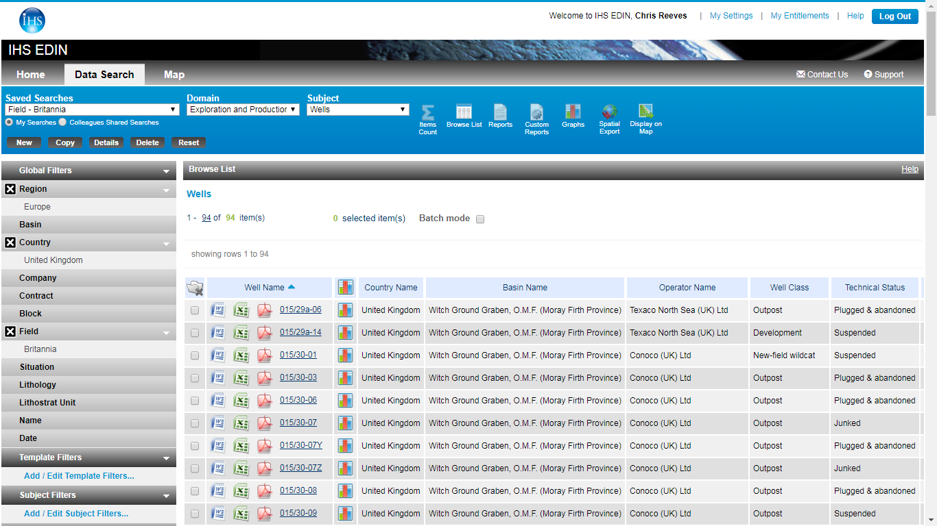
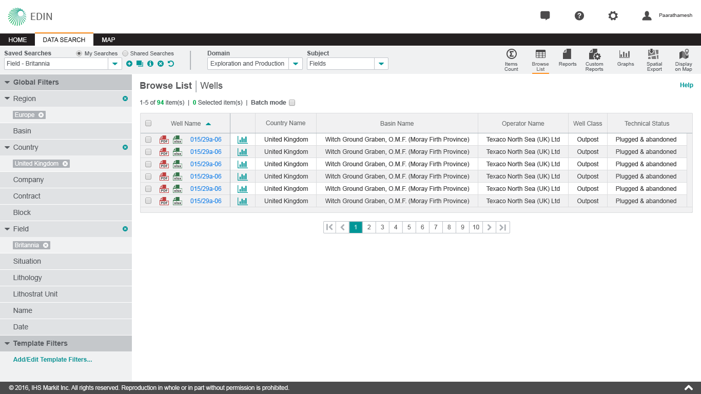
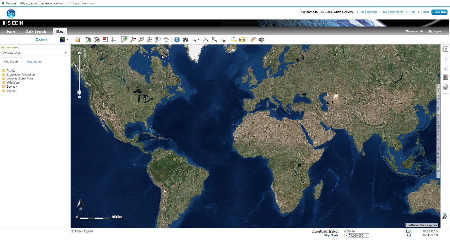
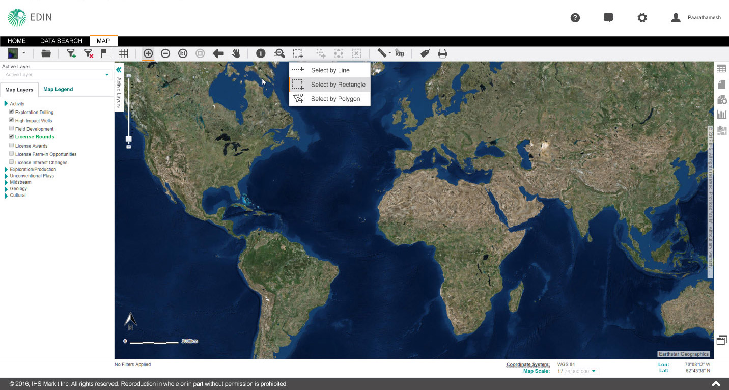
Modernizing 

a design system

Going beyond mere brand updates to modernize a design eco-system

Art Direction, Visual Design & Project Management

Overview

About the Project

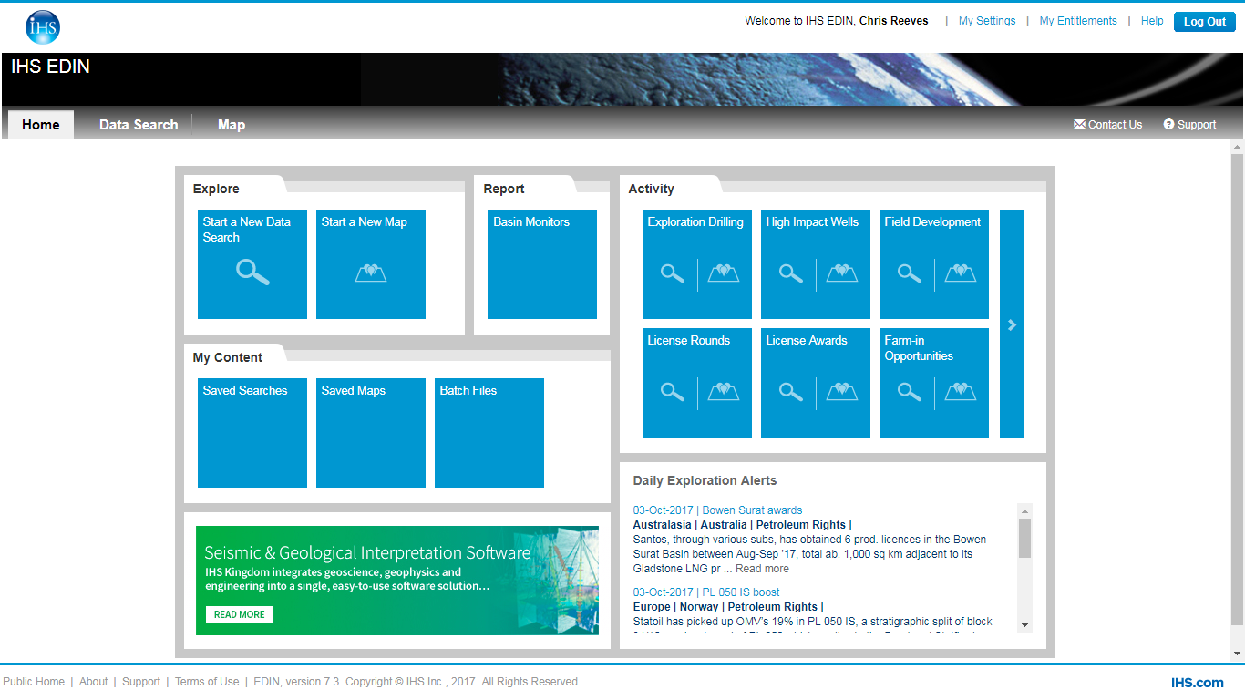
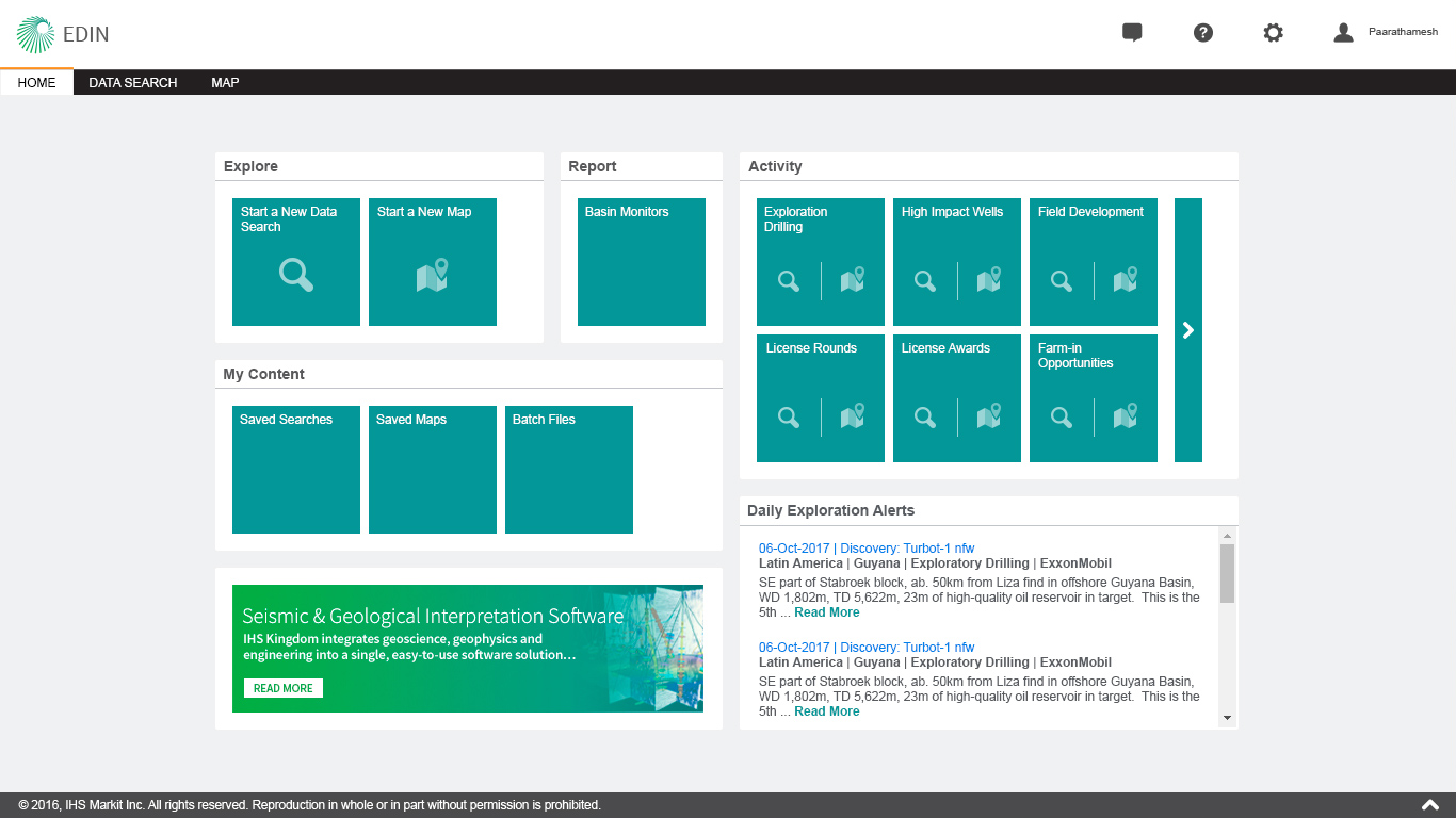
The summer of 2016 saw 2 mergers, the larger merger of IHS Inc. with Markit to form IHS Markit (IHSM) and the merger of my UX team from the Energy group into the global UX team to form one large super team. Soon after the corporate merger, the brand team released the new corporate brand guidelines and business leadership had a renewed interest in updating the look & feel and consistency of products. At long last we had an opportunity to modernize the design eco-system at the corporate level.

Design Objective

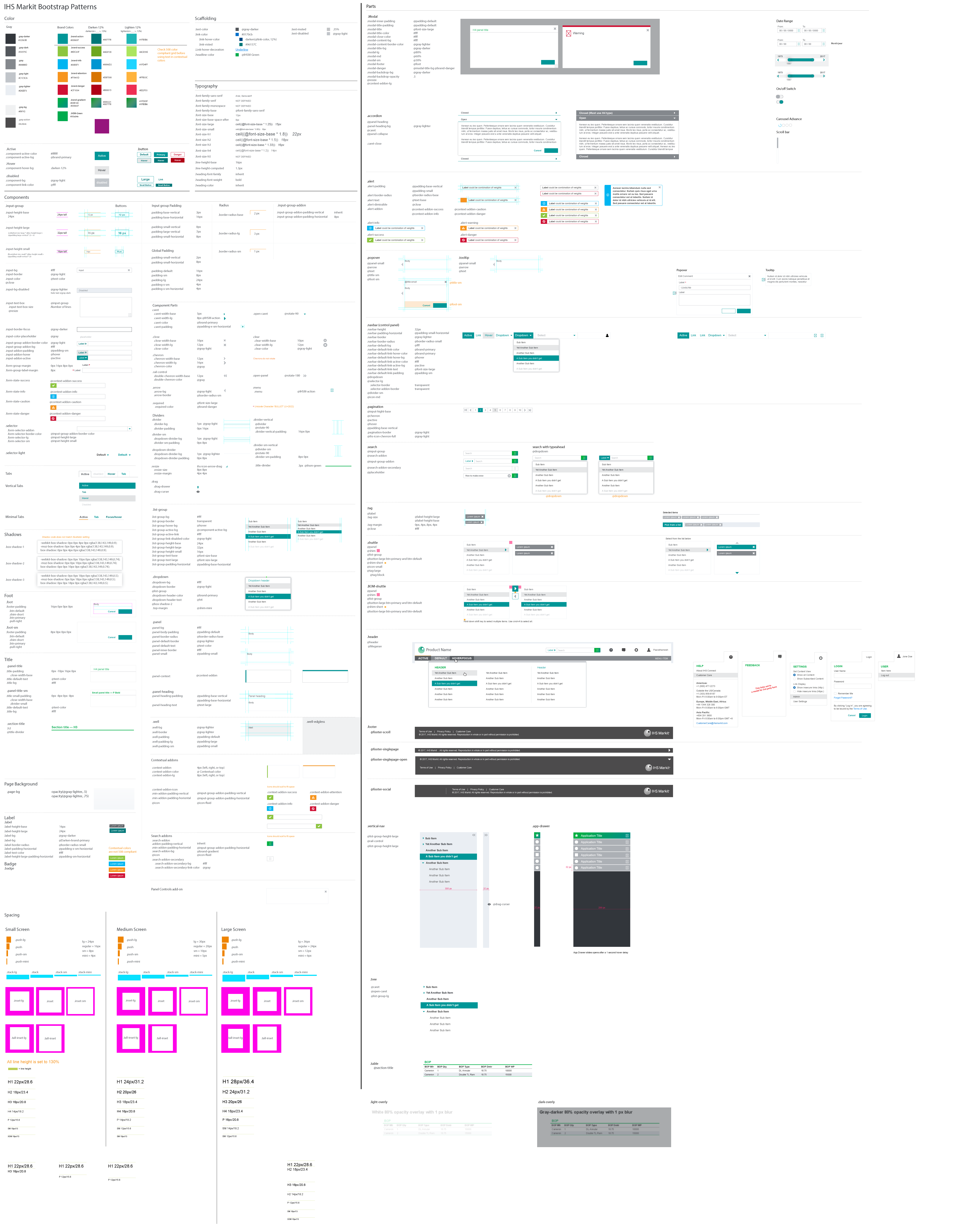
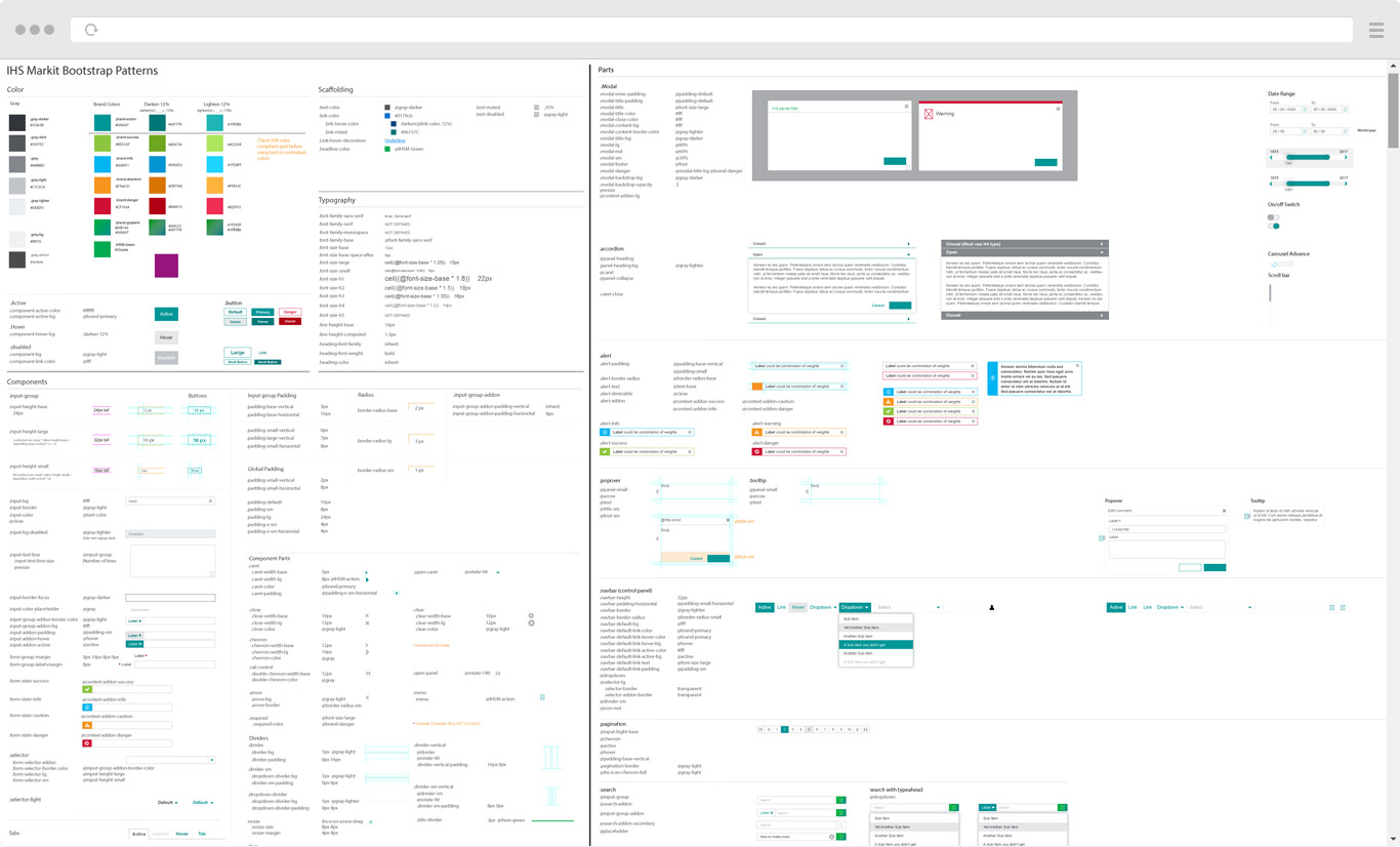
The overall goal of the initiative was to update and modernize the visual language, standardize interactions, and create a common pattern library to facilitate consistency and quicker implementations for developers. This was a large undertaking that we knew would be an ongoing process, requiring multiple phases, and would very likely evolve over time as priorities shifted between products and other design efforts going on at the same time. Additional phases were also slated to occur after my involvement with the project ended.

My Role

For this initiative, I was equal partners with my counterpart from the global UX team. As co-art-directors, we were responsible for laying the groundwork of the new design system, designing the initial set of components/patterns, setting up the new common pattern library, as well as overseeing the production of product mocks and their implementation.

Process

Phase 1

The first phase of the modernization effort mainly focused on laying the foundation for the rest of the system and some simple updates to a number of products as a first step towards unifying the brand and patterns between products. We also faced a few challenges along the way, the first of which being the merger of our own UX team into a single larger team. Most folks on the team had not worked with each other before, save for a few folks and even then only sparingly. I was the visual design lead for my team and the other team had another fellow in the same shoes for their team. The two of us decided to set up a weekly design workshop session with the goal of just getting to know one another and to talk shop. Fortunately for us, we found that our personalities were very similar and collaboration was a breeze. We were able to very quickly begin outlining the new design system.

One of the first things we did was to outline a set of guiding priciples that would serve as the basis of the design language moving forward and to help junior designers coming in get into the same design headspace we were operating in. To name a few examples of these principles, they included things like the proper usage of white space and de-cluttering to reduce cognitive load for users, guidelines on proximity of objects for grouping/hierarchical purposes, usage of movement to enhance interactions and delight users, and how to use shadows to show different depth levels of objects. We were inspired by other great design systems like GE's Predix, Google Material Design, and Ant Design.

After the guiding principles were done, we began work on adapting the brand color palette for usage in product UI and updating the new look and feel for components and patterns. Redesigning components and patterns would be an ongoing task where we focused items that would give us the most bang for our buck first before branching out to other less commonly used items. Creating more visual cohesion and pattern consistency between products was one of the prime objectives business leaders asked of us, as many products had not seen design updates on this scale in several years... over a decade for some! 

In the second half of phase 1, while my counterpart was getting a pattern library repository built, I was responsible for overseeing the creation and delivery of a series of product mockups that leveraged a new common header/footer combination as well as conducting impact assessment evaluations. I met frequently with product owners and dev teams to get designs road mapped for implementation and keep things on schedule for release. I also devised a strategy for product launch icons and created a unified login screen template for our mobile products. 

Fig 2 - Example of unified login screen for mobile

PHase 2

2017 encapsulated most of phase 2, which focused on the launch of an expanded common pattern library and creating full interface mockups of key Energy applications using the new standardized patterns. Initially the pattern library existed only as an internal website intended as a repository and reference to our UX team. This was made public within the company and continuously updated throughout the year as we fleshed out the patterns. A second website was launched that hosted coded samples of finished patterns intended for consumption by dev teams. The UX site acted as sort of a preview of the freshest patterns while the Dev site hosted the coded "stable" patterns ready for implementation.  

For my own part, I oversaw several design efforts across multiple products. Many product owners were particularly eager to see visual updates for their products and reports as there was a growing perception among clients that if the product looked dated, the data must be too. A brand update of several Energy reports was done to bring them inline with the new color palette from the pattern library as well as high fidelity concepts of full visual overhauls of key Energy web applications and a new upstream intelligence mobile app. 

Fig 3 - Components for new common pattern library
Fig 4 - Upstream intelligence mobile app, map view
Fig 5 - Upstream intelligence mobile app, region overview
Fig 6 - Upstream intelligence mobile app, list view
Results

Clean Aesthetics & Faster development

When the dev version of the pattern library launched, it was a big win with dev teams and product managers as it equated to a huge time saver. Dev teams could pull down code for direct implementation or simply load the latest NPM package to update their codebase to the latest pattern versions. All stakeholders were pleased with the new cleaner aesthetic and improved consistency between products... ease of consumption just made the new system that much sweeter for everyone.

EDIN, IHSM's flagship international upstream web application, was the first application to begin actually utilizing and implementing patterns from the new pattern library. After the report work we delivered for them and seeing the proposed mocks for their application, EDIN's product owners were ecstatic about the new look and feel. I personally worked with the product owners and dev teams to insure proper implementation and to ensure quick response if issues arose. Private previews of the new version of EDIN were given to select external clientele and all were
extremely excited about the new look.

Fig 7 - EDIN home screen, before refresh
Fig 8 - EDIN home screen, using common pattern library styles

Fig 9 - EDIN data search screen, before refresh
Fig 10 - EDIN data search screen, using common pattern library styles
Fig 11 - EDIN map screen, before refresh
Fig 12 - EDIN map screen, using common pattern library styles
Fig 13 - EDIN sheet report, before refresh
Fig 14 - EDIN sheet report, using common pattern library styles

The new look is fantasic, it really feels like an entirely new app. 

- EDIN Product Owner

© 2018 Modcollectiv. All products/brands/trademarks copyright of their respective owners. Made with  in Houston, Texas.